Nomad is an online store from California focusing on adventurous souls. Their business revolves mainly around minimalism, functionality, and durability. Their high-quality and reliable products range from leather phone cases and watch straps to lenses and wireless chargers.
Basically they have cool and practical products that caught our eye immediately. So we signed up to their email list to check what their welcome emails look like. Let’s dive in!
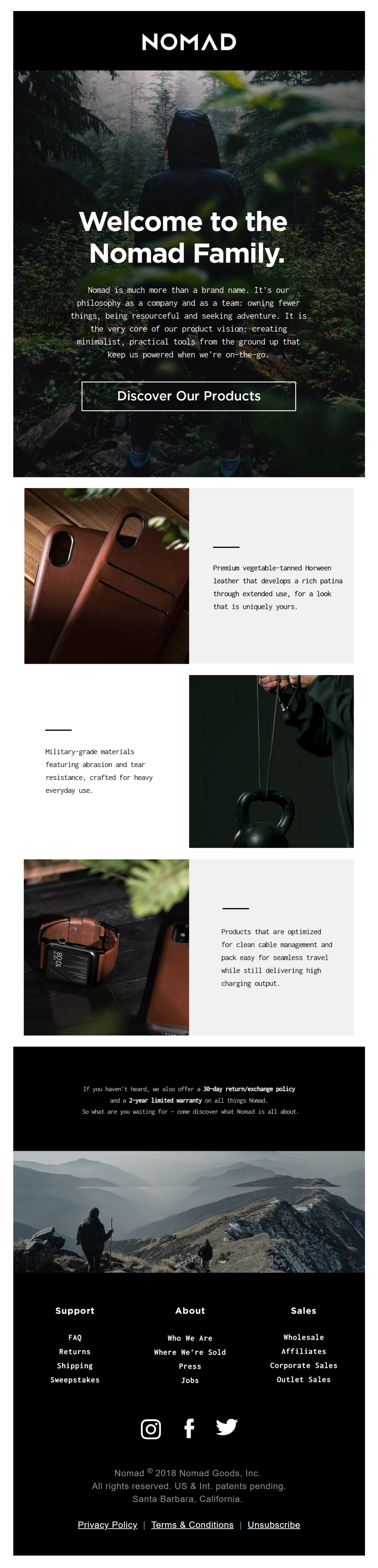
1. Welcome To The Nomad Life
The first email we received welcomes the new member to the NOMAD family, reinforces their brand values and urges them to discover their products.
And they do all that above the fold. Nice one!
Then they continue by explaining what separates their brand from their competition. The product features are nicely transformed into benefits so that customers aren’t bombarded with boring facts. Kudos on the copy, guys. This makes that customers understand the value of NOMAD’s products better.
To end the email, they list two other great benefits: their 30-day return policy and 2-year warranty. A great way to gain trust and to remove any hesitance of buying a product.
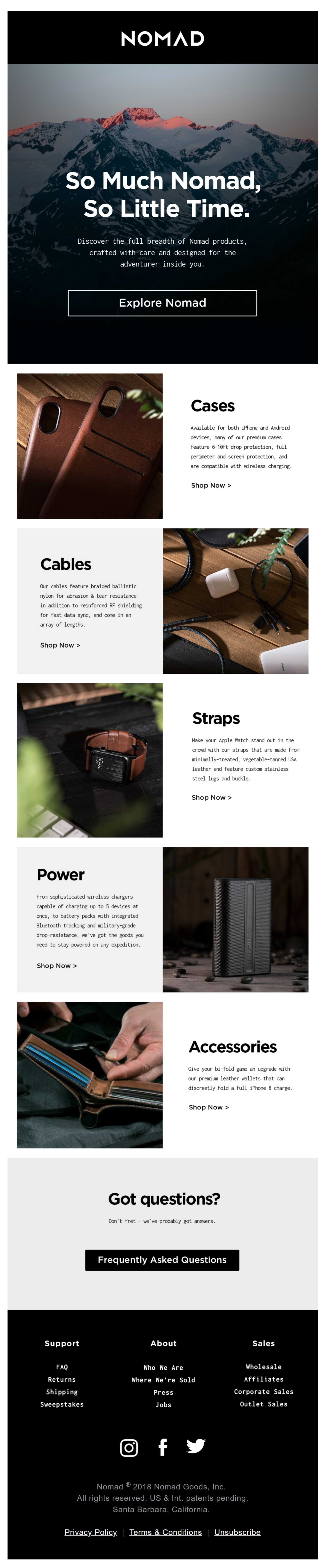
2. It's good to be a Nomad - find out why
2 days later after receiving the first email, we see the next email coming in.
While their first email focused mainly on benefits, their second email focuses on NOMAD’s product range. By featuring their product categories in an attractive way, they make sure that you get a clear overview of what they have to offer.
To offer an answer to the most common questions that people might have, this email also includes a link to NOMAD’s Frequently Asked Questions page. A great way to open the door a little bit more and to get rid of any friction that might exist.
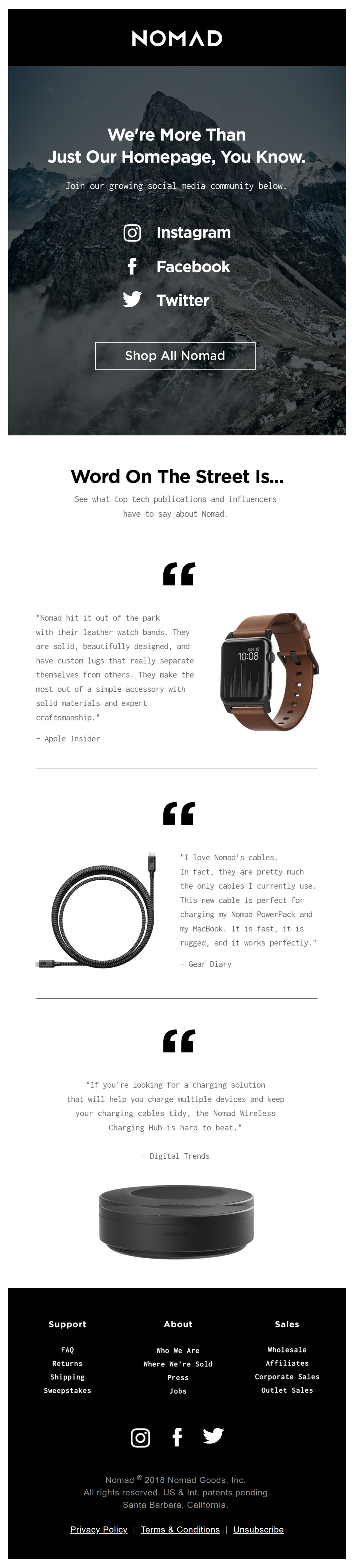
3. You're going to love what we have to offer
5 days later, another email pops up in our inbox and asks us to ‘Join their growing social media community’ on either Instagram, Facebook or Twitter. It’s good to send a dedicated email to promote your social media accounts. Just don’t forget to include a really good reason for your readers to follow you on different channels such as an exclusive contest or behind the scenes content.
Something we didn’t really understand is why they’d add a call to action button ‘Shop all Nomad‘, which – in this case – is a distraction from the main goal… following them on social media.
Adding testimonials from top publishers and influencers can reinforce the value of their products in the NOMAD community and is a bulletproof way to pull hesitating members over the edge. But again, it doesn’t fit with the main goal of this email.
Conclusion
Clean design, conform with their branding. Strong, appealing copy that excites the more adventurous types. In general, well done, NOMAD!
But we feel there’s always room for improvement. Here are some of our suggestions:
- Their emails mostly consist of images. This makes the email less readable on mobile devices and might have some loss-of-message when these emails are opened in mailclients that don’t show images automatically. There could be a better balance between images and HTML text.
- Make sure that call to actions are inline with the goal of your emails. Secondary call to actions can be included but need to be less prominent.
We’re really curious about what you think of these emails. What are your favorite tactics? And how do you think they could improve their program?
We’re looking forward to your comments!