Rule number 1 for growing your email list? Give your visitors tons of options to sign up.
It’s really that simple.
If you aren’t putting your signup forms in the right places or worse – hiding it somewhere in your footer or behind a link – you are missing out on subscribers, potential customers and sales.
But where and when do you ask your visitors to sign up? Well, that’s exactly what you’ll learn in this article.
Here are 10 top performing places to put email sign up forms.
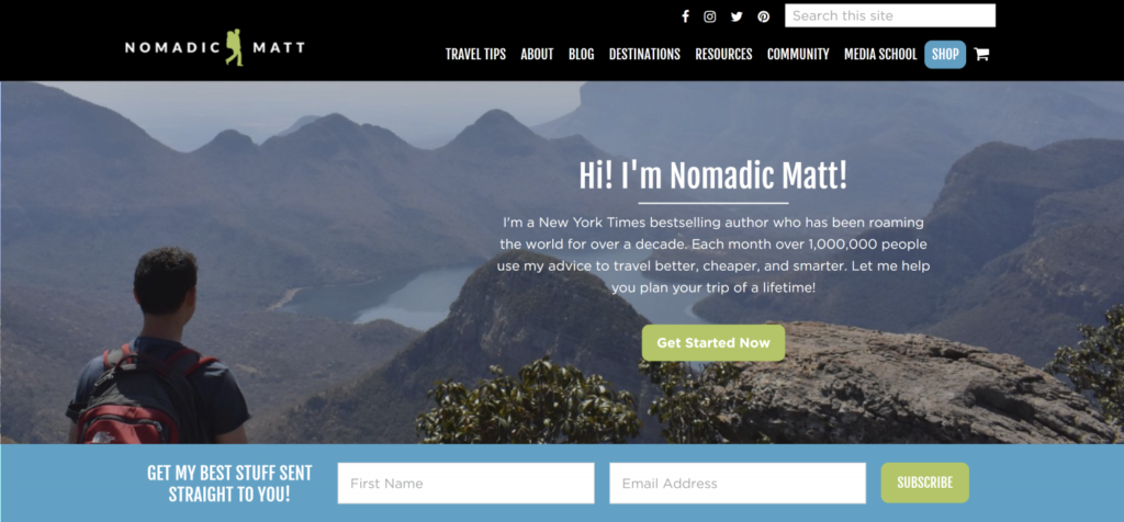
1. Your website homepage
A pretty obvious place but you’d be surprised how many businesses haven’t got a clearly visible signup form on their homepage.
Nomadic Matt features his email signup form on his homepage AND it’s shown above the fold so that visitors can see it without having to scroll.
2. At the top of your sidebar
Without pulling too much attention, this place puts your signup form in a prominent place. Website visitors are used to finding signup forms there so you can’t go wrong with this.
If you want, you can even add other important call to actions or ads in the sidebar.
3. A notification bar across your website
You’ve probably noticed this one before. I’m talking about that little bar across the top or bottom of your website.
Now that’s a great place to put your email signup form. Because it’s always right there in your face. Wherever you scroll.
It’s advised to show this bar only the first couple of times when someone visits your website. If you leave it there continuously, your visitors might stop noticing it.
Neil Patel uses this technique to highlight his Advanced SEO webinar. Great choice to add the exclamation icon.
4. In your website footer
Although this is an out of sight-spot, it is a place where people expect to find an email signup form. You should definitely include one as an addition to more in sight-spots.
Also, when a visitor reaches your website footer, it means that they liked reading or watching your content, right? So if there’s a signup form in place…. BAM, you’ve got a new subscriber. Just like that.
5. When you run a social media campaign or contest
While social media is great for attracting leads with engaging content, campaigns and contests,… ideally these leads end up on your email list. Because only then you can talk to them personally.
When you set up a social media campaign or contest, why not include a newsletter subscription as a condition to participate? This is a proven method to boost your email list growth. Just make sure you mention clearly that you will use their email address for future communications and that they can opt out any time they want.
Tip: Send out a confirmation mail immediately after someone signs up to filter out price hunters who were just focusing on the contest price.
After the confirmation mail you can add your new subscribers to an automated email sequence that teaches them more about your brand, services and products.
6. Below or in between your blog posts
Visitors who read your blog posts are engaged, curious and looking for answers or entertainment. The perfect situation to put your awesome email offer in the picture. You can put the form at the end of each post, but also as a featured box in between your article content.
7. Create a dedicated landingpage
Having a dedicated landingpage for your email offer or newsletter subscription form is a bulletproof tactic to capture the attention (and email address) of your website visitor.
By removing all other distractions like navigation items, blogposts and other call to actions, there is a 100% focus on your main email offer and the signup form.
Set up on your website as a pop-up styled page (pops up after a few seconds), a full page takeover or it can exist as an entirely seperate page.
8. Use a sticky scrollbox
Similar to the popup (see nr 10), this box slides in at the left/right/bottom side of your screen and it stays there until the visitor clicks away. Wherever they scroll, this feature box stays in sight. Although it’s not as intrusive as a pop-up, it still highly-visible without blocking your reader’s view of your content.
Hotjar combines the ‘end-of-blogpost’ signup form with a sticky (popup) box in the bottom right corner.
9. On your about page
Have a look at your website statistics. Chances are that your about page is one of your most popular pages. Why not put a signup form there as well? You might catch some extra leads.
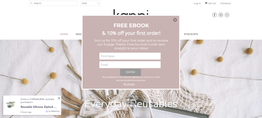
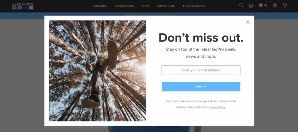
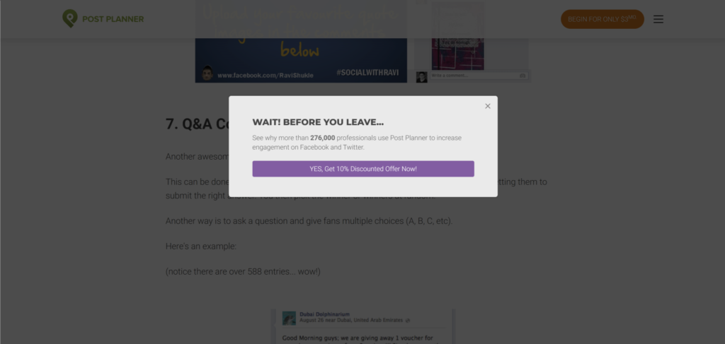
10. Pop-ups
I have a love/hate relationship with pop ups…
I don’t like how pop-ups are thrown in my face while I’m enjoying some content. They are intrusive, annoying and feel really pushy.
But…
They actually work.
After experimenting with a scrollbox (see nr 8), I learned that 25% of my leads were coming through this method. Obviously, that’s a number I can’t ignore so I’ve decided to leave it there.
When choosing a pop-up, you can also decide when they are shown: after X seconds, at the end of the page, when someone intents to leave your website,… I suggest to test which one performs best for your business.
Conclusion
Obviously, you can’t use all these sign up methods at the same time on your website. That would be overkill and frankly, quite annoying for your visitors.
Each business is unique so I’d suggest to experiment with 3-4 methods and then analyze how they perform. Replace the ones that aren’t delivering any significant results and throw another one in the mix. Keep on doing this until you are reaching your golden combo.